Categories
Posts in this category
- Current State of Exceptions in Rakudo and Perl 6
- Meet DBIish, a Perl 6 Database Interface
- doc.perl6.org and p6doc
- Exceptions Grant Report for May 2012
- Exceptions Grant Report -- Final update
- Perl 6 Hackathon in Oslo: Be Prepared!
- Localization for Exception Messages
- News in the Rakudo 2012.05 release
- News in the Rakudo 2012.06 release
- Perl 6 Hackathon in Oslo: Report From The First Day
- Perl 6 Hackathon in Oslo: Report From The Second Day
- Quo Vadis Perl?
- Rakudo Hack: Dynamic Export Lists
- SQLite support for DBIish
- Stop The Rewrites!
- Upcoming Perl 6 Hackathon in Oslo, Norway
- A small regex optimization for NQP and Rakudo
- Pattern Matching and Unpacking
- Rakudo's Abstract Syntax Tree
- The REPL trick
- First day at YAPC::Europe 2013 in Kiev
- YAPC Europe 2013 Day 2
- YAPC Europe 2013 Day 3
- A new Perl 6 community server - call for funding
- New Perl 6 community server now live, accepting signups
- A new Perl 6 community server - update
- All Perl 6 modules in a box
- doc.perl6.org: some stats, future directions
- Profiling Perl 6 code on IRC
- Why is it hard to write a compiler for Perl 6?
- Writing docs helps you take the user's perspective
- Perl 6 Advent Calendar 2016 -- Call for Authors
- Perl 6 By Example: Running Rakudo
- Perl 6 By Example: Formatting a Sudoku Puzzle
- Perl 6 By Example: Testing the Say Function
- Perl 6 By Example: Testing the Timestamp Converter
- Perl 6 By Example: Datetime Conversion for the Command Line
- What is Perl 6?
- Perl 6 By Example, Another Perl 6 Book
- Perl 6 By Example: Silent Cron, a Cron Wrapper
- Perl 6 By Example: Testing Silent Cron
- Perl 6 By Example: Stateful Silent Cron
- Perl 6 By Example: Perl 6 Review
- Perl 6 By Example: Parsing INI files
- Perl 6 By Example: Improved INI Parsing with Grammars
- Perl 6 By Example: Generating Good Parse Errors from a Parser
- Perl 6 By Example: A File and Directory Usage Graph
- Perl 6 By Example: Functional Refactorings for Directory Visualization Code
- Perl 6 By Example: A Unicode Search Tool
- What's a Variable, Exactly?
- Perl 6 By Example: Plotting using Matplotlib and Inline::Python
- Perl 6 By Example: Stacked Plots with Matplotlib
- Perl 6 By Example: Idiomatic Use of Inline::Python
- Perl 6 By Example: Now "Perl 6 Fundamentals"
- Perl 6 Books Landscape in June 2017
- Living on the (b)leading edge
- The Loss of Name and Orientation
- Perl 6 Fundamentals Now Available for Purchase
- My Ten Years of Perl 6
- Perl 6 Coding Contest 2019: Seeking Task Makers
- A shiny perl6.org site
- Creating an entry point for newcomers
- An offer for software developers: free IRC logging
- Sprixel, a 6 compiler powered by JavaScript
- Announcing try.rakudo.org, an interactive Perl 6 shell in your browser
- Another perl6.org iteration
- Blackjack and Perl 6
- Why I commit Crud to the Perl 6 Test Suite
- This Week's Contribution to Perl 6 Week 5: Implement Str.trans
- This Week's Contribution to Perl 6
- This Week's Contribution to Perl 6 Week 8: Implement $*ARGFILES for Rakudo
- This Week's Contribution to Perl 6 Week 6: Improve Book markup
- This Week's Contribution to Perl 6 Week 2: Fix up a test
- This Week's Contribution to Perl 6 Week 9: Implement Hash.pick for Rakudo
- This Week's Contribution to Perl 6 Week 11: Improve an error message for Hyper Operators
- This Week's Contribution to Perl 6 - Lottery Intermission
- This Week's Contribution to Perl 6 Week 3: Write supporting code for the MAIN sub
- This Week's Contribution to Perl 6 Week 1: A website for proto
- This Week's Contribution to Perl 6 Week 4: Implement :samecase for .subst
- This Week's Contribution to Perl 6 Week 10: Implement samespace for Rakudo
- This Week's Contribution to Perl 6 Week 7: Implement try.rakudo.org
- What is the "Cool" class in Perl 6?
- Report from the Perl 6 Hackathon in Copenhagen
- Custom operators in Rakudo
- A Perl 6 Date Module
- Defined Behaviour with Undefined Values
- Dissecting the "Starry obfu"
- The case for distributed version control systems
- Perl 6: Failing Softly with Unthrown Exceptions
- Perl 6 Compiler Feature Matrix
- The first Perl 6 module on CPAN
- A Foray into Perl 5 land
- Gabor: Keep going
- First Grant Report: Structured Error Messages
- Second Grant Report: Structured Error Messages
- Third Grant Report: Structured Error Messages
- Fourth Grant Report: Structured Error Messages
- Google Summer of Code Mentor Recap
- How core is core?
- How fast is Rakudo's "nom" branch?
- Building a Huffman Tree With Rakudo
- Immutable Sigils and Context
- Is Perl 6 really Perl?
- Mini-Challenge: Write Your Prisoner's Dilemma Strategy
- List.classify
- Longest Palindrome by Regex
- Perl 6: Lost in Wonderland
- Lots of momentum in the Perl 6 community
- Monetize Perl 6?
- Musings on Rakudo's spectest chart
- My first executable from Perl 6
- My first YAPC - YAPC::EU 2010 in Pisa
- Trying to implement new operators - failed
- Programming Languages Are Not Zero Sum
- Perl 6 notes from February 2011
- Notes from the YAPC::EU 2010 Rakudo hackathon
- Let's build an object
- Perl 6 is optimized for fun
- How to get a parse tree for a Perl 6 Program
- Pascal's Triangle in Perl 6
- Perl 6 in 2009
- Perl 6 in 2010
- Perl 6 in 2011 - A Retrospection
- Perl 6 ticket life cycle
- The Perl Survey and Perl 6
- The Perl 6 Advent Calendar
- Perl 6 Questions on Perlmonks
- Physical modeling with Math::Model and Perl 6
- How to Plot a Segment of a Circle with SVG
- Results from the Prisoner's Dilemma Challenge
- Protected Attributes Make No Sense
- Publicity for Perl 6
- PVC - Perl 6 Vocabulary Coach
- Fixing Rakudo Memory Leaks
- Rakudo architectural overview
- Rakudo Rocks
- Rakudo "star" announced
- My personal "I want a PONIE" wish list for Rakudo Star
- Rakudo's rough edges
- Rats and other pets
- The Real World Strikes Back - or why you shouldn't forbid stuff just because you think it's wrong
- Releasing Rakudo made easy
- Set Phasers to Stun!
- Starry Perl 6 obfu
- Recent Perl 6 Developments August 2008
- The State of Regex Modifiers in Rakudo
- Strings and Buffers
- Subroutines vs. Methods - Differences and Commonalities
- A SVG plotting adventure
- A Syntax Highlighter for Perl 6
- Test Suite Reorganization: How to move tests
- The Happiness of Design Convergence
- Thoughts on masak's Perl 6 Coding Contest
- The Three-Fold Function of the Smart Match Operator
- Perl 6 Tidings from September and October 2008
- Perl 6 Tidings for November 2008
- Perl 6 Tidings from December 2008
- Perl 6 Tidings from January 2009
- Perl 6 Tidings from February 2009
- Perl 6 Tidings from March 2009
- Perl 6 Tidings from April 2009
- Perl 6 Tidings from May 2009
- Perl 6 Tidings from May 2009 (second iteration)
- Perl 6 Tidings from June 2009
- Perl 6 Tidings from August 2009
- Perl 6 Tidings from October 2009
- Timeline for a syntax change in Perl 6
- Visualizing match trees
- Want to write shiny SVG graphics with Perl 6? Port Scruffy!
- We write a Perl 6 book for you
- When we reach 100% we did something wrong
- Where Rakudo Lives Now
- Why Rakudo needs NQP
- Why was the Perl 6 Advent Calendar such a Success?
- What you can write in Perl 6 today
- Why you don't need the Y combinator in Perl 6
- You are good enough!
Sun, 26 Mar 2017
Perl 6 By Example: Stacked Plots with Matplotlib
Permanent link

This blog post is part of my ongoing project to write a book about Perl 6.
If you're interested, either in this book project or any other Perl 6 book news, please sign up for the mailing list at the bottom of the article, or here. It will be low volume (less than an email per month, on average).
In a previous episode, we've explored plotting git statistics in Perl 6 using matplotlib.
Since I wasn't quite happy with the result, I want to explore using stacked plots for presenting the same information. In a regular plot, the y coordiante of each plotted value is proportional to its value. In a stacked plot, it is the distance to the previous value that is proportional to its value. This is nice for values that add up to a total that is also interesting.
Matplotlib offers a method called
stackplot
for that. Contrary to multiple plot calls on subplot object, it
requires a shared x axis for all data series. So we must construct
one array for each author of git commits, where dates with no value come
out as zero.
As a reminder, this is what the logic for extracting the stats looked like in the first place:
my $proc = run :out, <git log --date=short --pretty=format:%ad!%an>;
my (%total, %by-author, %dates);
for $proc.out.lines -> $line {
    my ( $date, $author ) = $line.split: '!', 2;
    %total{$author}++;
    %by-author{$author}{$date}++;
    %dates{$date}++;
}
my @top-authors = %total.sort(-*.value).head(5)>>.key;
And some infrastructure for plotting with matplotlib:
my $py = Inline::Python.new;
$py.run('import datetime');
$py.run('import matplotlib.pyplot');
sub plot(Str $name, |c) {
    $py.call('matplotlib.pyplot', $name, |c);
}
sub pydate(Str $d) {
    $py.call('datetime', 'date', $d.split('-').map(*.Int));
}

my ($figure, $subplots) = plot('subplots');
$figure.autofmt_xdate();
So now we have to construct an array of arrays, where each inner array has the values for one author:
my @dates = %dates.keys.sort;
my @stack = $[] xx @top-authors;

for @dates -> $d {
    for @top-authors.kv -> $idx, $author {
        @stack[$idx].push: %by-author{$author}{$d} // 0;
    }
}
Now plotting becomes a simple matter of a method call, followed by the usual commands adding a title and showing the plot:
$subplots.stackplot($[@dates.map(&pydate)], @stack);
plot('title', 'Contributions per day');
plot('show');
The result (again run on the zef source repository) is this:
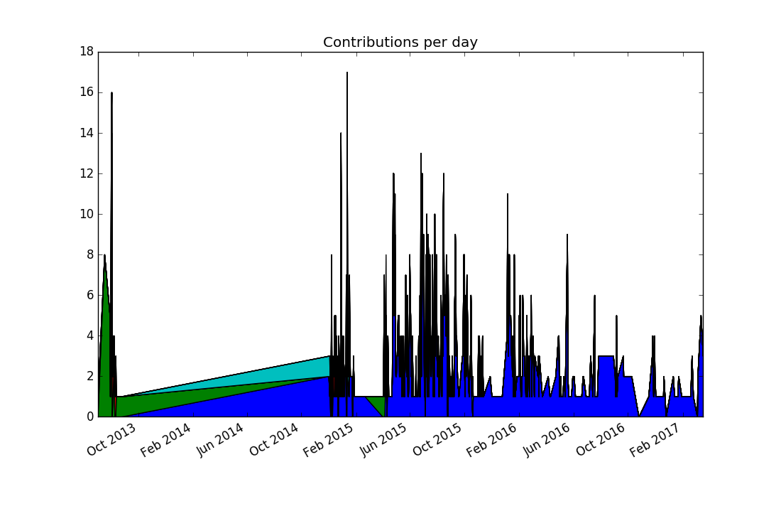
Comparing this to the previous visualization reveals a discrepancy: There were no commits in 2014, and yet the stacked plot makes it appear this way. In fact, the previous plots would have shown the same "alternative facts" if we had chosen lines instead of points. It comes from matplotlib (like nearly all plotting libraries) interpolates linearly between data points. But in our case, a date with no data points means zero commits happened on that date.
To communicate this to matplotlib, we must explicitly insert zero values for missing dates. This can be achieved by replacing
my @dates = %dates.keys.sort;
with the line
my @dates = %dates.keys.minmax;
The minmax method
finds the minimal and maximal values, and returns them in a
Range. Assigning the range to an
array turns it into an array of all values between the minimal and the
maximal value. The logic for assembling the @stack variable already
maps missing values to zero.
The result looks a bit better, but still far from perfect:
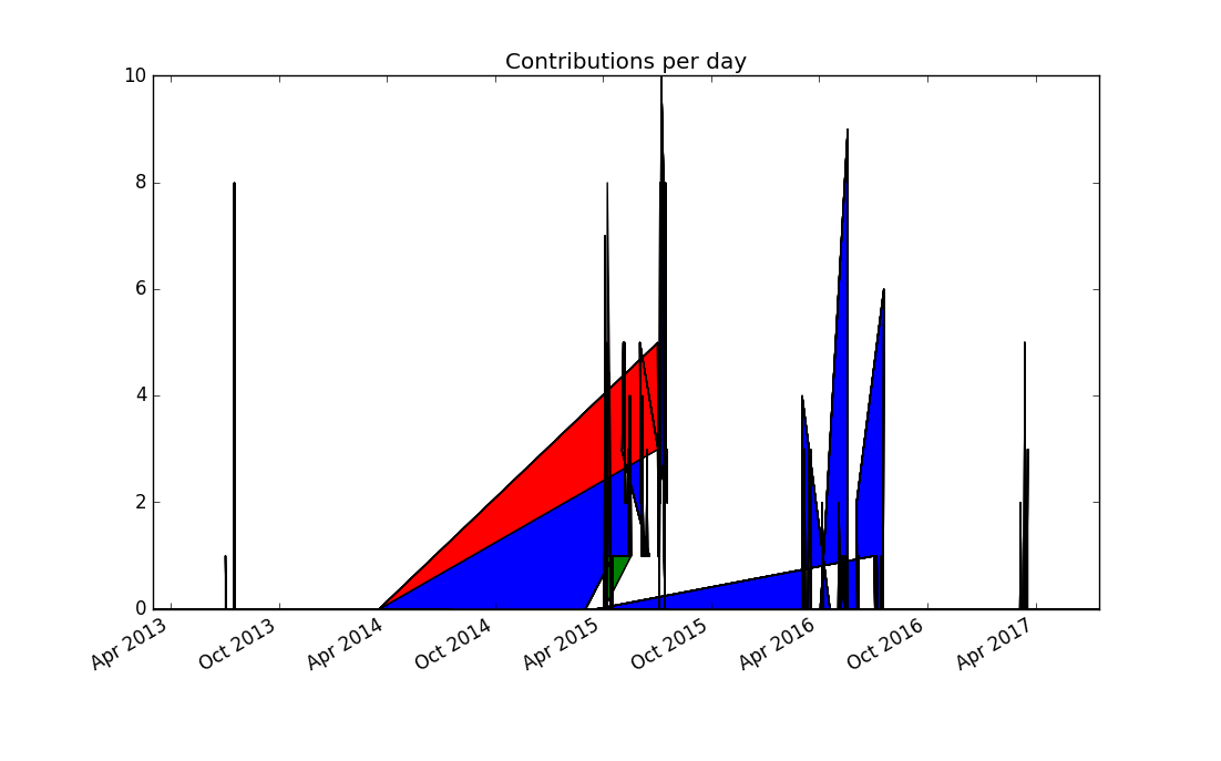
Thinking more about the problem, contributions from separate days should not be joined together, because it produces misleading results. Matplotlib doesn't support adding a legend automatically to stacked plots, so this seems to be to be a dead end.
Since a dot plot didn't work very well, let's try a different kind of
plot that represents each data point separately: a bar chart, or more
specifically, a stacked bar chart. Matplotlib offers the bar plotting
method, and a named parameter bottom can be used to generate the
stacking:
my @dates = %dates.keys.sort;
my @stack = $[] xx @top-authors;
my @bottom = $[] xx @top-authors;

for @dates -> $d {
    my $bottom = 0;
    for @top-authors.kv -> $idx, $author {
        @bottom[$idx].push: $bottom;
        my $value = %by-author{$author}{$d} // 0;
        @stack[$idx].push: $value;
        $bottom += $value;
    }
}
We need to supply color names ourselves, and set the edge color of the bars to the same color, otherwise the black edge color dominates the result:
my $width = 1.0;
my @colors = <red green blue yellow black>;
my @plots;

for @top-authors.kv -> $idx, $author {
    @plots.push: plot(
        'bar',
        $[@dates.map(&pydate)],
        @stack[$idx],
        $width,
        bottom => @bottom[$idx],
        color => @colors[$idx],
        edgecolor => @colors[$idx],
    );
}
plot('legend', $@plots, $@top-authors);

plot('title', 'Contributions per day');
plot('show');
This produces the first plot that's actually informative and not misleading (provided you're not color blind):
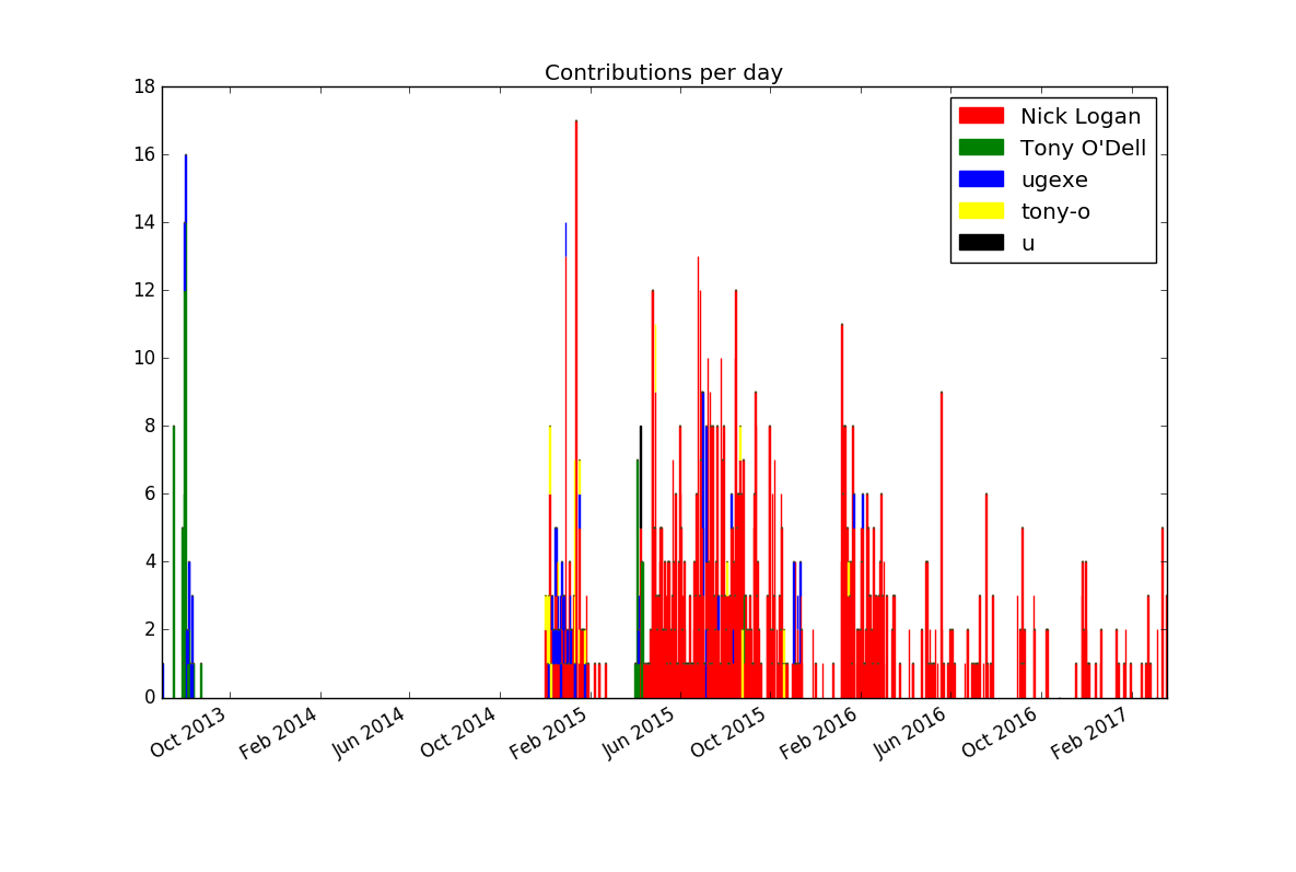
If you want to improve the result further, you could experiment with
limiting the number of bars by lumping together contributions by week or
month (or maybe $n-day period).
Next, we'll investigate ways to make the matplotlib API more idiomatic to use from Perl 6 code.